Dashboards & Reports
See everything, without living in it.
Clean dashboards and reports give you visibility and accountability when you need it, without requiring daily attention.
Clean dashboards & reports
Pre-built reports that matter, and custom built dashboards for everything else.
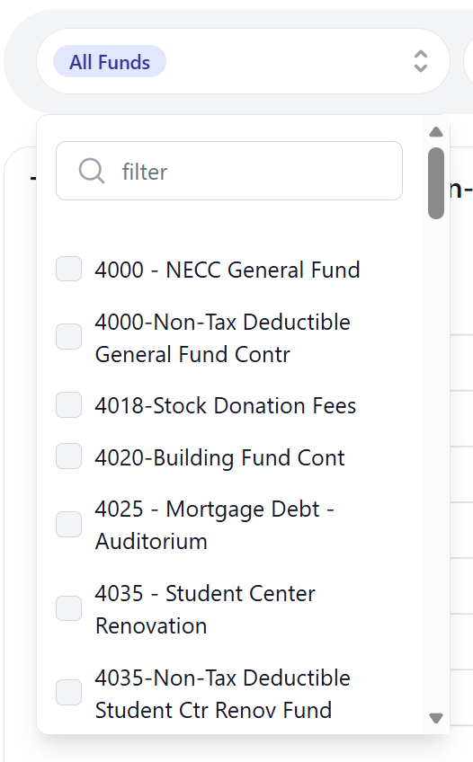
Filter.
Filtering shouldn't be hard.
By default, GivFlow allows you to sort and filter almost every screen by one or fund(s), campus, or amounts.
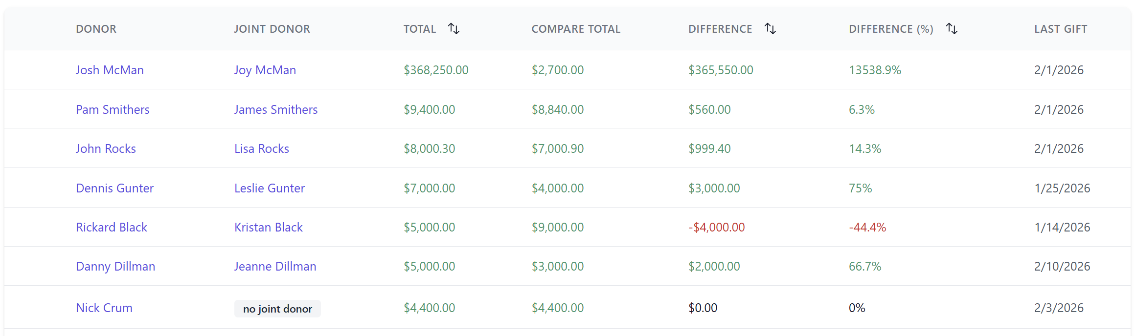
Donor Units.
Reports that make sense.
Finally an easy way to look at giving by donor units and compare it to different giving date ranges.
Take a closer look. See which donors have given more, less, by percentage or dollars, or donors haven't given it all.
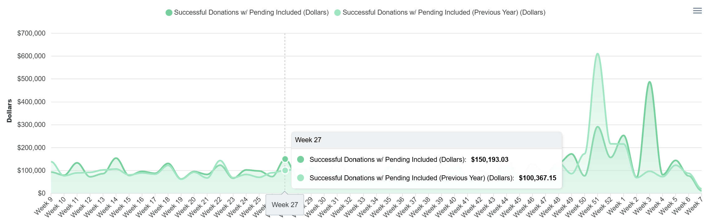
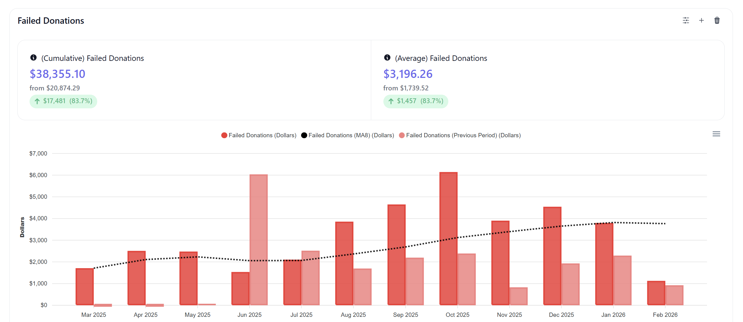
Compare.
Dashboards that are useful.
Once you've built your dashboard, compare year over year, or period over period.
Set dashboard defaults by different fund(s), date ranges, and layout options. Change the display type to whatever makes more sense to you. Work directly with our team to build a dashboard how you want!
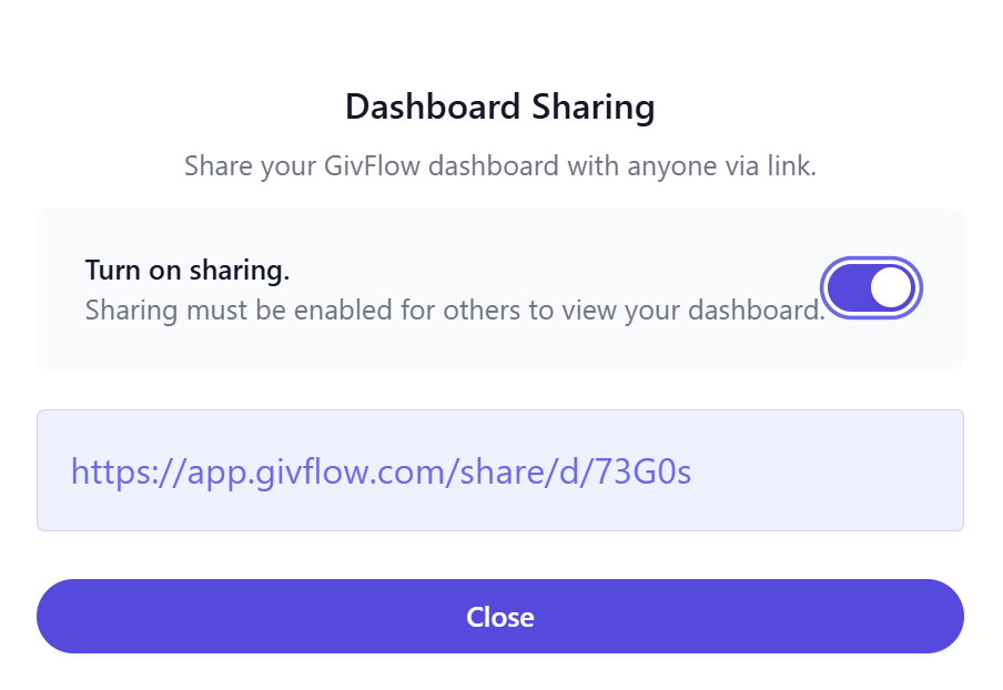
Stay informed.
Sharing on easy mode.
Like all of your other favorite tools, just copy your dashboard link and send to your elders or other leaders that are asking questions!
Disable sharing whenever you're done. Simple as that.
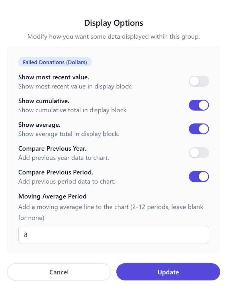
Customize.
Measure what matters, your way.
GivFlow lets you tailor how giving trends are viewed — whether you’re comparing year over year, period over period, or smoothing noise with moving and cumulative averages.
Purpose driven.
Dashboards when you need them.
GivFlow provides clean, purpose-built dashboards that give you visibility into giving trends, donor behavior, and automation outcomes.
They’re designed to answer the questions leaders ask — without requiring you to monitor numbers day after day.
See what happens when giving is handled well.
We would love to connect and chat with you about your organization and how GivFlow might be able to help you specifically.